Subway tiles have been a kitchen and bathroom staple for over a century, but today’s designers are pushing them beyond the standard horizontal layout. With the right patterns and finishes, these classic rectangles can bring real personality, depth, and style to any space.
Modern layouts allow you to play with scale, direction, and color to create striking backsplashes or feature walls. Whether you want subtle sophistication or bold drama, exploring fresh subway tile arrangements can completely transform a room from ordinary to unforgettable.
Classic Layouts That Got a Serious Glow-Up
Look, traditional patterns aren’t dead-they just needed some caffeine. Designers are taking those familiar arrangements and cranking up the volume with smarter color choices, bigger tiles, and unexpected details that feel fresh without abandoning what works.
The Old-School Running Bond Gets Interesting
That offset brick look? Still totally valid, especially when you mess with the formula a bit. Imagine throwing 4×12 tiles (instead of the standard 3×6) into the mix, then hitting them with charcoal grout that creates this bold, graphic vibe. Kitchen upgrades that nail these modern touches aren’t just pretty-they’re profitable. Recent numbers show renovations like this can tack an extra $28,826 onto your home’s resale value. That’s not pocket change.
Here’s another move: color blocking within the same running bond pattern. Two different tile colors, same installation method, completely different energy. You create visual zones without getting fancy with the actual layout.
Going Vertical to Fake Higher Ceilings
Ceilings feeling a little… close? Stack those tiles straight up in a grid instead of staggering them. The unbroken vertical lines pull your eye upward, which makes cramped spaces suddenly feel like they can breathe. This works like magic when you’re designing your backsplash tile situation, especially behind the range or in those skinny galley kitchens where every trick counts.
Horizontal Stacking for That Zen Vibe
Flip the script and stack horizontally instead. You get this clean, orderly feel that works beautifully in contemporary spaces. It’s perfect when you want your tile color or finish to do the talking rather than competing with a busy pattern. Use matching grout for an almost seamless effect that looks expensive without screaming for attention.
Diagonal Patterns That Bring the Drama
Want movement? Angles are your friend. These layouts need more planning and cutting-no way around that-but the payoff can be seriously worth the extra hassle.
Herringbone: Still Stealing the Show
There’s a reason herringbone keeps topping trend lists. It hits that sweet spot between classic craftsmanship and modern edge. The 45-degree zigzag creates crazy depth, especially with bathroom tiles that have subtle color variations. Shower walls are where this pattern really shines-those repeating V-shapes add instant luxury without requiring fancy materials.
Chevron When You Want All Eyes on Your Walls
Chevron and herringbone look like cousins, but chevron’s the sharper-dressed one. The tiles get cut at angles to create continuous, precise V-shapes rather than just being arranged diagonally. This gives you a more polished, intentional look that’s perfect for backsplash ideas for kitchen accent walls. The pattern basically demands attention, so use it where you want your tile to be the star of the room.
Pro tip: try a gradient that shifts from light to dark across your chevron pattern. That ombre effect? Actually stunning.
Playing with Color and Finish Like a Pro
Pattern’s only half the story. Your color and finish choices create depth that single-color installations just can’t touch.
Monochrome Doesn’t Mean Boring
You don’t need a rainbow to make an impact. Try the same color in different finishes-matte lower, glossy upper-for subtle definition that still reads as cohesive. Or go bigger with a dark-to-light gradient in the same color family. That custom, high-end feeling? You just faked it for way less.
When you’re planning tile for bathroom installations, think about where your eyes naturally land. Put your boldest moves at eye level, where they’ll actually get seen.
Mixing Textures Changes Everything
Glossy tiles bounce light around and brighten spaces. Matte finishes absorb light for a softer, earthier vibe. Industry predictions for 2025 show warm neutrals leading at 49%, dark earthy tones at 48%, and deep jewel tones at 34%. Mixing finishes within these trendy palettes? That’s how you get sophisticated depth.
The contrast creates different looks throughout the day as light shifts, which basically means your tile does double duty.
Different Rooms, Different Rules
What works behind your cooktop won’t necessarily translate to your shower. Let’s break down the best moves by space.
Kitchen Backsplashes That Won’t Be Ignored
Full-height backsplashes are everywhere right now, running from the counter straight to the ceiling. This looks especially killer with vertical or herringbone patterns that emphasize height. Just make sure your kitchen floor tile choices don’t compete-two busy patterns fighting for attention never ends well.
Windows and outlets need strategic thinking. Center your pattern on these features so cuts land symmetrically on both sides rather than creating weird, awkward partial tiles.
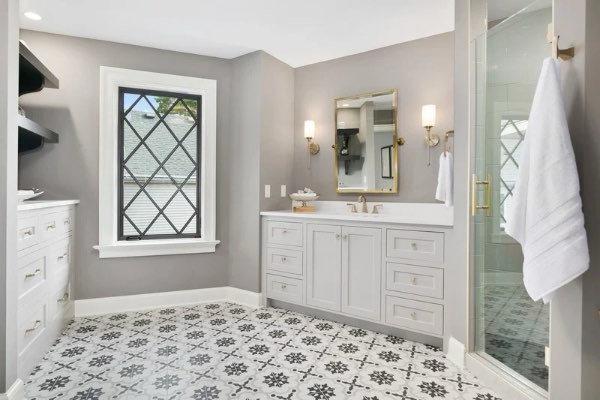
Bathrooms: Your Tile Playground
Showers give you permission to experiment with patterns that might feel too intense in larger doses. Herringbone tile for bathroom walls creates that spa feeling, especially when extended from floor to ceiling. For powder rooms, wainscoting at 36-42 inches protects walls without overwhelming small spaces.
Think about how your pattern interacts with fixtures and niches. These should feel like part of the design, not interruptions.
Getting Installation Right (Because It Really Matters)
Beautiful tile looks terrible when it’s poorly installed. Proper planning solves most problems before they start.
Dry-Fitting: Your Safety Net
Never skip dry-fitting before mixing mortar. This preview lets you see how cuts will fall and make adjustments while everything’s still movable. Start from your most visible spot and work outward, ensuring full tiles hit focal points rather than skinny slivers. According to the National Institute of Building Sciences, proper prep and layout planning directly impact long-term performance.
Order 10% extra for straight patterns, 15% for diagonal, and 20% for complex layouts like herringbone to cover cuts and breakage.
What’s Behind Your Tile Matters More Than You Think
Don’t cheap out on substrate. Cement board or waterproof membrane systems prevent moisture damage that’ll destroy even perfect tile work. Showers need real waterproofing systems-not just water-resistant drywall.
Your substrate must be flat and stable. Any movement or unevenness eventually cracks grout lines or tiles themselves.
Your Next Move
Modern subway tile layouts show that these classic rectangles are anything but boring. From updated traditional patterns to bold diagonal arrangements, there’s a layout to suit every style and space. The right design turns ordinary walls into striking focal points that elevate both aesthetics and functionality.
Take your time exploring patterns, colors, and finishes that resonate with your vision, and plan carefully to ensure a flawless installation. When done thoughtfully, a subway tile backsplash doesn’t just protect your walls-it becomes a lasting statement piece that keeps your kitchen or bathroom looking fresh and stylish for years to come.
Quick Answers to Common Questions
What’s the easiest pattern for DIYers?
Traditional horizontal running bond forgives mistakes better than grid or diagonal patterns where every line needs perfect alignment. Start here before tackling complex layouts.
Horizontal or vertical-how do I decide?
Consider your room’s challenges. Horizontal makes narrow spaces feel wider; vertical adds height to low-ceilinged rooms. Pick whichever solves your biggest problem.
Can I mix different tile sizes?
Totally, but keep proportions cohesive. Successful mixed-size installations use tiles from the same line with proportional dimensions like 2×6, 3×6, and 4×6. Keep color and finish consistent.